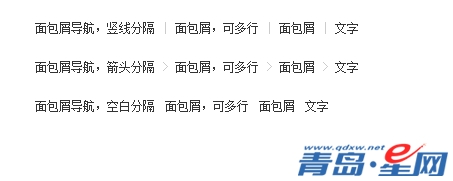
网站三列布局结构是很常见的一种结构,但是左侧自动适应宽度呢?青岛星网下面跟大家分享:DIV+CSS三列左侧自动适应布局代码。

<div class="g-bd4 f-cb">
    <div class="g-mn4">
        <div class="g-mn4c">
            <p>左侧自适应</p>
        </div>
    </div>
    <div class="g-sd41">
        <p>右侧定宽</p>
    </div>
    <div class="g-sd42">
        <p>右侧定宽</p>
    </div>
</div>/* 三列左侧自适应布局 */
.g-bd4{margin:0 0 10px;}
.g-sd41,.g-sd42{position:relative;float:right;width:190px;}
.g-sd41{width:230px;margin-left:10px;}
.g-mn4{float:left;width:100%;margin-right:-430px;}
.g-mn4c{margin-right:440px;}
/* 预览辅助样式 */
body{margin:20px;}
p{height:150px;padding:10px;color:#fff;background:#de9317; text-align:right;}
.g-sd41 p{background:#1ba1e2;}
.g-sd42 p{background:#034888;}
 在线QQ:
在线QQ: